(Difference between pages)
No edit summary Tag: 2017 source edit |
No edit summary |
||
| Line 1: | Line 1: | ||
{{Featurepage|featured=true|featuredesc=How-to: Display page sections as cards|featurestart=03/21/2022}} | |||
Sections of a wiki page can be displayed as "cards" with just a little bit of effort. | |||
== What are cards? == | |||
Cards are combinations of contiguous page sections that share the same column layout. Each wiki page can contain such cards. | |||
<gallery widths="480" heights="250"> | |||
File:Manual:karten-before.png|alt=Wiki page without cards|Wiki page without cards | |||
File:Manual:karten-after.png|alt=Wiki page with cards|Wiki page with cards | |||
</gallery> | |||
| | |||
| | |||
| | |||
| | |||
</ | |||
== Create card styles == | |||
Before sections can be formatted as cards, a user with admin rights must add and save the following information to the page ''MediaWiki:Common.css'': | |||
< | <syntaxhighlight lang="css"> | ||
/* Styles for section cards */ | |||
.sectionflex {display: flex; flex-wrap: wrap; justify-content:space-between;} | |||
{ | .sectionflex.col1 > div {flex-basis:100%; padding:10px 20px 20px 20px; margin:10px 0;} | ||
.sectionflex.col2 > div {flex-basis:49%; padding:10px 20px 20px 20px; margin:10px 0;} | |||
.sectionflex.col3 > div {flex-basis:32%; padding:10px 20px 20px 20px; margin:10px 0;} | |||
.sectionflex > div h2 {margin:0 0 1em 0; font-size:1.3em} | |||
.sectionflex.frame > div {border: 1px solid #e7e7e7} | |||
.sectionflex.background> div {background: #f1f3f9} | |||
.sectionflex .ve-ce-branchNode-slug, .sectionflex span.mw-editsection {display:none} | |||
@media (max-width: 767px) {.sectionflex.col2 > div, .sectionflex.col3 > div {flex-basis:100%; margin-top:2em}} | |||
{ | |||
</syntaxhighlight> | |||
== Create cards == | |||
To format sections as cards: | |||
# '''Create''' a page that contains different sections. Sections are marked by headings. | |||
# '''Open''' the page in source editing mode. | |||
# '''Add''' the start of a card container as <code><nowiki><div class="sectionflex col2 background"></nowiki></code> above the first section you want to include in the card display (i.e., above the first heading of that section). A heading starts with two equal (=) signs:<syntaxhighlight lang="text"> | |||
<div class="sectionflex col2 background"> | |||
==Introduction== | |||
With more than 165,000 inhabitants, Regensburg is the fourth-largest city in the State of Bavaria after Munich, Nuremberg and Augsburg. | |||
</syntaxhighlight> | |||
# '''Wrap''' all sections that you want to include in this card layout in a starting <code><nowiki><div></nowiki></code> and an end <code><nowiki></div></nowiki></code> tag:<syntaxhighlight lang="text"> | |||
<div class="sectionflex col2 background"> | |||
<div> | |||
==Introduction== | |||
With more than 165,000 inhabitants, Regensburg is the fourth-largest city in the State of Bavaria after Munich, Nuremberg and Augsburg.(...) | |||
</div> | |||
<div> | |||
==Topography== | |||
Regensburg is situated on the northernmost part of the Danube river at the geological crossroads of four distinct landscapes (...) | |||
</div> | |||
</syntaxhighlight> | |||
# '''Close''' the sectionflex container itself with an end <code><nowiki></div></nowiki></code> tag:<syntaxhighlight lang="text"> | |||
<div class="sectionflex col2 background"> <! --- Start card layout--> | |||
<div> <! --- Start card --> | |||
==Introduction== | |||
With more than 165,000 inhabitants, Regensburg is the fourth-largest city in the State of Bavaria after Munich, Nuremberg and Augsburg.(...) | |||
</div> <! --- End card --> | |||
<div> <! --- Start card --> | |||
==Topography== | |||
Regensburg is situated on the northernmost part of the Danube river at the geological crossroads of four distinct landscapes (...) | |||
</div> <! --- End card --> | |||
</div> <! --- End card layout --> | |||
</syntaxhighlight> | |||
The two sections should now be displayed as cards: | |||
[[File:Manual:karten-after.png|alt=Two sections in the card layout|center|thumb|750x750px|Two sections in the card layout: <code><nowiki><div class="sectionflex col2 background"></nowiki></code>]] | |||
== Available card formats == | |||
You can choose between 1-column ("col1"), 2-column ("col2") or 3-column ("col3") cards with grey background ("background") or grey frame ("frame"). For example: | |||
[[File:Manual:karten-col3-frame.png|alt=3-column layout with frame|center|thumb|750x750px|3 columns with frame: <code><nowiki><div class="sectionflex col3 frame"></nowiki></code>]] | |||
== Combination of cards == | |||
It is possible to combine different card layouts on one wiki page: | |||
<syntaxhighlight lang="css"> | |||
<div class="sectionflex col2 frame"> | |||
<div> | |||
==Section 1== | |||
Content section 1 | |||
</div> | |||
<div> | |||
==Section 2== | |||
Content section 1 | |||
</div> | |||
</div> | |||
<div class="sectionflex col3 background"> | |||
<div> | |||
==Section 3== | |||
Content section 3 | |||
</div> | |||
<div> | |||
==Section 4== | |||
Content section 4 | |||
</div> | |||
<div> | |||
==Section 5== | |||
Content section 5 | |||
</div> | |||
</div> | </div> | ||
[[ | </syntaxhighlight> | ||
[[en:{{FULLPAGENAME}}]] | |||
[[de:Handbuch:Seitenabschnitte_als_Karten_darstellen]] | |||
[[Category:Customization]] | |||
[[Category:Portal]] | |||
Revision as of 15:09, 15 September 2022
Sections of a wiki page can be displayed as "cards" with just a little bit of effort.
What are cards?
Cards are combinations of contiguous page sections that share the same column layout. Each wiki page can contain such cards.
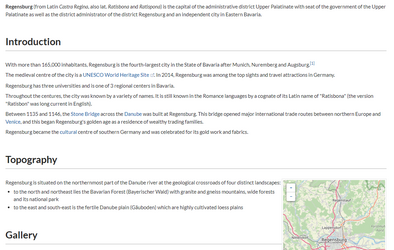
Wiki page without cards
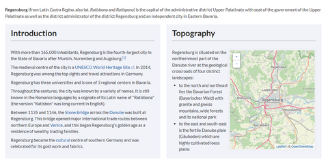
Wiki page with cards


Create card styles
Before sections can be formatted as cards, a user with admin rights must add and save the following information to the page MediaWiki:Common.css:
/* Styles for section cards */
.sectionflex {display: flex; flex-wrap: wrap; justify-content:space-between;}
.sectionflex.col1 > div {flex-basis:100%; padding:10px 20px 20px 20px; margin:10px 0;}
.sectionflex.col2 > div {flex-basis:49%; padding:10px 20px 20px 20px; margin:10px 0;}
.sectionflex.col3 > div {flex-basis:32%; padding:10px 20px 20px 20px; margin:10px 0;}
.sectionflex > div h2 {margin:0 0 1em 0; font-size:1.3em}
.sectionflex.frame > div {border: 1px solid #e7e7e7}
.sectionflex.background> div {background: #f1f3f9}
.sectionflex .ve-ce-branchNode-slug, .sectionflex  span.mw-editsection {display:none}
@media (max-width: 767px) {.sectionflex.col2 > div, .sectionflex.col3 > div {flex-basis:100%; margin-top:2em}}
Create cards
To format sections as cards:
- Create a page that contains different sections. Sections are marked by headings.
- Open the page in source editing mode.
- Add the start of a card container as
<div class="sectionflex col2 background">above the first section you want to include in the card display (i.e., above the first heading of that section). A heading starts with two equal (=) signs:<div class="sectionflex col2 background"> ==Introduction== With more than 165,000 inhabitants, Regensburg is the fourth-largest city in the State of Bavaria after Munich, Nuremberg and Augsburg.
- Wrap all sections that you want to include in this card layout in a starting
<div>and an end</div>tag:<div class="sectionflex col2 background"> <div> ==Introduction== With more than 165,000 inhabitants, Regensburg is the fourth-largest city in the State of Bavaria after Munich, Nuremberg and Augsburg.(...) </div> <div> ==Topography== Regensburg is situated on the northernmost part of the Danube river at the geological crossroads of four distinct landscapes (...) </div>
- Close the sectionflex container itself with an end
</div>tag:<div class="sectionflex col2 background"> <! --- Start card layout--> <div> <! --- Start card --> ==Introduction== With more than 165,000 inhabitants, Regensburg is the fourth-largest city in the State of Bavaria after Munich, Nuremberg and Augsburg.(...) </div> <! --- End card --> <div> <! --- Start card --> ==Topography== Regensburg is situated on the northernmost part of the Danube river at the geological crossroads of four distinct landscapes (...) </div> <! --- End card --> </div> <! --- End card layout -->
The two sections should now be displayed as cards:
Available card formats
You can choose between 1-column ("col1"), 2-column ("col2") or 3-column ("col3") cards with grey background ("background") or grey frame ("frame"). For example:

Combination of cards
It is possible to combine different card layouts on one wiki page:
<div class="sectionflex col2 frame">
<div>
==Section 1==
Content section 1
</div>
<div>
==Section 2==
Content section 1
</div>
</div>

<div class="sectionflex col3 background">
<div>
==Section 3==
Content section 3
</div>
<div>
==Section 4==
Content section 4
</div>
<div>
==Section 5==
Content section 5
</div>
</div>
Discussions