No edit summary |
No edit summary |
||
| (19 intermediate revisions by 2 users not shown) | |||
| Line 1: | Line 1: | ||
<bookshelf src="Book:Admin manual" /> | <bookshelf src="Book:Admin manual" /> | ||
{{DISPLAYTITLE:FlexiSkin}} | {{DISPLAYTITLE:Customizing the user interface (FlexiSkin)}} | ||
== Access == | |||
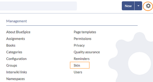
You can access the special page (''Special:FlexiSkin)'' for customizing the skin from the ''Global actions'' menu: | |||
''{{Icon|bi bi-gear-fill|||middle}} (Global actions) > Administration > Skin'' | |||
==Logo and Favicon== | The page allows you to customize the logo, favicon, colors and font settings of the wiki. To edit the page, you need ''admin-''rights in the wiki. | ||
[[File:FlexiSkin link.png|alt=Administration links of the global actions menu|center|thumb|500x500px|Link for customizing the skin]] | |||
<span><br /></span> | |||
{{Messagebox|boxtype=important|icon=|Note text=If you don't see the changes in the wiki after saving your settings, you need to clear your browser cache (<code>Ctrl</code>+ <code>F5</code>).|bgcolor=}} | |||
==Logo and Favicon == | |||
===Logo=== | ===Logo=== | ||
'''To upload your logo:''' | '''To upload your logo:''' | ||
# '''Click''' ''Select a file'' <span style="color: rgb(51, 51, 51)">to choose a file from your file explorer</span> '''or drag the file''' <span style="color: rgb(51, 51, 51)">into the dotted area of the Logo upload area.</span>[[File:Manual:logo-upload-dialog.png|alt=Upload a logo|center|thumb|140x140px|Upload a logo]] | #'''Click''' ''Select a file'' <span style="color: rgb(51, 51, 51)">to choose a file from your file explorer</span> '''or drag the file''' <span style="color: rgb(51, 51, 51)">into the dotted area of the Logo upload area.</span>[[File:Manual:logo-upload-dialog.png|alt=Upload a logo|center|thumb|140x140px|Upload a logo]] | ||
# '''Click''' the ''Preview'' button on the page and check the placement of the logo. | #'''Click''' the ''Preview'' button on the page and check the placement of the logo. | ||
# '''Click''' ''Save & activate''. The logo is now visible for all users. | #'''Click''' ''Save & activate''. The logo is now visible for all users. | ||
To use '''a different logo''', click the "x" symbol in the upload area of the logo and repeat the steps above. | To use '''a different logo''', click the "x" symbol in the upload area of the logo and repeat the steps above. | ||
| Line 24: | Line 32: | ||
==Layout colors== | ==Layout colors== | ||
Here you can adjust the colors of the individual layout areas. | Here you can adjust the colors of the individual layout areas. | ||
[[File:Manual:flexi-main-annotiert-EN.png|alt=Flexiskin | [[File:Manual:flexi-main-annotiert-EN.png|alt=Flexiskin page showing custom skin colors already applied|center|thumb|650x650px|Flexiskin layout colors]] | ||
*'''Header color (3):''' Color settings for the header bar. These colors also apply to the mega menus.[[File:Manual:flexi-headers-EN.png|alt= | *'''Header color (3):''' Color settings for the header bar. These colors also apply to the mega menus.[[File:Manual:flexi-headers-EN.png|alt=Custom Menu with applied custom colors|center|thumb|650x650px|Mega menu]] | ||
*'''Sidebar colors (4):''' Color settings for the main navigation and the page tools. | *'''Sidebar colors (4):''' Color settings for the main navigation and the page tools. | ||
*'''Footer colors (5):''' Color settings for the footer.<br /> | *'''Footer colors (5):''' Color settings for the footer.<span /><span /><br /> | ||
The following options to enter a color value are available: | The following options to enter a color value are available: | ||
*'''Standard color palette:''' A standard color can be selected by clicking on a color preview.[[File:Manual:fs-colorpicker.png|alt=Color picker|center|thumb|192x192px|Color picker]] | *'''Standard color palette:''' A standard color can be selected by clicking on a color preview.[[File:Manual:fs-colorpicker.png|alt=Color picker for sidebar highlight|center|thumb|192x192px|Color picker]] | ||
*'''Pencil symbol:''' Click on the pencil symbol to select a color from the color mixer. | *'''Pencil symbol:''' Click on the pencil symbol to select a color from the color mixer. | ||
*'''Manually entering a value:''' To provide a custom value (e.g., your for your CI colors), enter the hex-value for the color. | *'''Manually entering a value:''' To provide a custom value (e.g., your for your CI colors), enter the hex-value for the color. | ||
| Line 37: | Line 45: | ||
* | * | ||
{| class="wikitable" | {| class="wikitable" style="" | ||
|+Standardfarben des "Discovery"-Skin | |+Standardfarben des "Discovery"-Skin | ||
! | ! | ||
| Line 56: | Line 64: | ||
|Footer | |Footer | ||
|#<span style="color: rgb(32, 33, 34)">d3d3d3</span> | |#<span style="color: rgb(32, 33, 34)">d3d3d3</span> | ||
|#454545 | | #454545 | ||
| - | | - | ||
|} | |} | ||
==Content== | == Content== | ||
These settings apply to all styles of the content area of a wiki page:<br /> | These settings apply to all styles of the content area of a wiki page:<span /><span /><br /> | ||
===Colors=== | === Colors=== | ||
Here you can adjust the background, font and link colors. Broken links in the wiki are shown in red by default so that they can be easily identified. You should carefully consider whether you want to deviate from this convention. If you want to color visited links differently than standard links, you can insert the following setting in the Free CSS area:<syntaxhighlight lang="css"> | Here you can adjust the background, font and link colors. Broken links in the wiki are shown in red by default so that they can be easily identified. You should carefully consider whether you want to deviate from this convention. If you want to color visited links differently than standard links, you can insert the following setting in the Free CSS area:<syntaxhighlight lang="css"> | ||
#mw-content-text a:visited,[class^="mw-content-"] a:visited {color: #951b81;} | #mw-content-text a:visited,[class^="mw-content-"] a:visited {color: #951b81;} | ||
</syntaxhighlight> | </syntaxhighlight> | ||
=== Font === | ===Font === | ||
The font settings only apply to the text in the content area. The text in other areas such as B. in the navigation and toolbars or in the menus is not affected. | The font settings only apply to the text in the content area. The text in other areas such as B. in the navigation and toolbars or in the menus is not affected. | ||
| Line 76: | Line 84: | ||
===Headers=== | ===Headers=== | ||
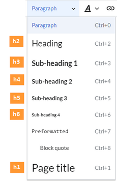
You can adjust the color, font size and underlining for all heading levels. You can also change the unit for the font settings (e.g. ''px'' instead of ''rem''). If you are not familiar with the differences between these units, just leave the default setting, ''rem''. This is based on the superordinate size setting in the wiki. In contrast, ''em'' sizes are in relation to the enclosing container. | You can adjust the color, font size and underlining for all heading levels. You can also change the unit for the font settings (e.g. ''px'' instead of ''rem''). If you are not familiar with the differences between these units, just leave the default setting, ''rem''. This is based on the superordinate size setting in the wiki. In contrast, ''em'' sizes are in relation to the enclosing container. | ||
[[File:Manual:fs-headings-EN.png|alt= | [[File:Manual:fs-headings-EN.png|alt=Expanded menu with paragraph formatting options|center|thumb|358x358px|Heading levels]] | ||
==Free CSS== | ==Free CSS== | ||
For additional customizations that are not possible with the FlexiSkin settings, you can use the ''Free CSS'' field if you are familiar with CSS. | {{Messagebox|boxtype=note|icon=|Note text=If the same styles are defined in both FlexiSkin or FlexiSkin Free CSS and in MediaWiki:Common.css, the styles from Common.css are applied.|bgcolor=}} | ||
For additional customizations that are not possible with the FlexiSkin settings, you can use the ''Free CSS'' field if you are familiar with CSS. Here are some examples. | |||
=== Bigger logo === | |||
To show the logo bigger, the width can be adjusted. A value ov 195px looks like a good starting point.<syntaxhighlight lang="css">/*logo width*/ | |||
.navbar a.mw-wiki-logo { | |||
width: 195px; | |||
}</syntaxhighlight> | |||
===Neutral page tools (right sidebar)=== | |||
If you select a color for your left navigation bar, you sometimes don't want the color to be applied to the right sidebar (the page tools). To keep the light-grey background, add the following Free CSS:<syntaxhighlight lang="css"> | |||
/*right sidebar*/ | /*right sidebar*/ | ||
#sb-sec-cnt {background-color:#efefef; color:#252525;} | #sb-sec-cnt { | ||
#sb-sec-cnt.card-header.menu-title {color:# | background-color: #efefef; | ||
color: #252525; | |||
} | |||
#sb-sec-cnt .card-header.menu-title { | |||
color: #5d5d5d; | |||
} | |||
</syntaxhighlight> | </syntaxhighlight> | ||
[[File:Manual:flexi-free-CSS.png|alt=Example of Free CSS|center|thumb|650x650px| | [[File:Manual:flexi-free-CSS.png|alt=Flexiskin page with annotated free css for sidebar colors |center|thumb|650x650px|Example of Free CSS]] | ||
===Neutral top bar backgrounds and hovers=== | |||
When you set the header hightlight color, it can happen that the automatically calculated values for the searchbar as well as the button hovers and backgrounds don't fit your needs. | |||
[[File:Manual:flexiskin-highlights-standard.png|alt=Open megamenu with automatically calculated hues|center|thumb|650x650px|Flexiskin highlights standard]] | |||
In this case, you can neutralize them to grey. | |||
[[File:Manual:flexiskin-highlights-neutral.png|alt=Mega menu with manually applied hues|center|thumb|650x650px|Neutral highlight colors]] | |||
Add the following Free CSS: | |||
<syntaxhighlight lang="css"> | |||
/*top bar neutral search box, button backgrounds and hovers */ | |||
#nb-pri form input, | |||
#nb-pri form button { | |||
border-color: #f1f3f3; | |||
} | |||
#nb-pri form input, | |||
#nb-pri form button, | |||
#sb-pri-tgl-btn, | |||
#sb-pri-tgl-btn:hover, | |||
.mws-dropdown-primary.dropdown-menu a:hover, | |||
a.ico-btn:hover, | |||
a#sb-sec-tgl-btn, | |||
#nb-pri form .bs-extendedsearch-searchbar-clear { | |||
background: #f1f3f3; | |||
} | |||
.mws-button-primary:hover { | |||
background-color: #747474; | |||
color: #fff; | |||
} | |||
/*button "new" */ | |||
#nb-pri .item-center-east .new-page-split-btn #new-content { | |||
background: #f1f3f3; | |||
border: 1px solid #cbcbcb; | |||
} | |||
/*top bar neutral bottom border*/ | |||
#nb-pri { | |||
box-shadow: 0 0 4px 0 #747474; | |||
} | |||
.card.mega-menu { | |||
box-shadow: inset 0 2px 3px -2px #747474; | |||
} | |||
/*mega menu neutral bottom overlay*/ | |||
@media (min-width: 768px) { | |||
.dropdown-menu.megamenu .mm-bg { | |||
background-color: #747474; | |||
} | |||
} | |||
/*mega menu neutral background small viewport*/ | |||
@media (max-width: 767px) { | |||
.menu-list li{ | |||
background-color: #f5f5f5; | |||
} | |||
.card.mega-menu { | |||
background-color: #fff; | |||
} | |||
} | |||
</syntaxhighlight> | |||
<br /> | === Removing the background swoosh from the login page === | ||
[[Category:BlueSpice | If you want to remove the blue background swoosh from the login page, add:<syntaxhighlight lang="css"> | ||
/*remove background swoosh from login page*/ | |||
body.mediawiki.page-Special_UserLogin { | |||
background-image:none | |||
} | |||
</syntaxhighlight><br /><span /><span /> | |||
[[Category:BlueSpice cloud]] | |||
{{translation}} | |||
Latest revision as of 07:27, 16 October 2025
Access
You can access the special page (Special:FlexiSkin) for customizing the skin from the Global actions menu:
(Global actions) > Administration > Skin
The page allows you to customize the logo, favicon, colors and font settings of the wiki. To edit the page, you need admin-rights in the wiki.
Logo and Favicon
Logo
To upload your logo:
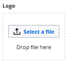
- Click Select a file to choose a file from your file explorer or drag the file into the dotted area of the Logo upload area.
Upload a logo - Click the Preview button on the page and check the placement of the logo.
- Click Save & activate. The logo is now visible for all users.
To use a different logo, click the "x" symbol in the upload area of the logo and repeat the steps above.
Favicon
The favicon is the image that is shown in the browser tabs. Follow the steps for uploading a logo, just use the favicon upload area instead.
Layout colors
Here you can adjust the colors of the individual layout areas.
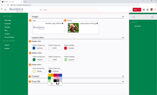
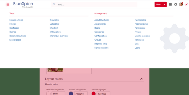
- Header color (3): Color settings for the header bar. These colors also apply to the mega menus.
Mega menu - Sidebar colors (4): Color settings for the main navigation and the page tools.
- Footer colors (5): Color settings for the footer.
The following options to enter a color value are available:
- Standard color palette: A standard color can be selected by clicking on a color preview.
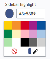
Color picker - Pencil symbol: Click on the pencil symbol to select a color from the color mixer.
- Manually entering a value: To provide a custom value (e.g., your for your CI colors), enter the hex-value for the color.
If you delete a color and FlexiSkin is saved with one or more empty color values, the standard colors of the Discovery skin are saved as values instead.
| Background | Foreground | Highlight | |
|---|---|---|---|
| Header | #ffffff | #252525 | #3e5389 |
| Sidebar | #f1f3f9 | #252525 | #3e5389 |
| Footer | #d3d3d3 | #454545 | - |
Content
These settings apply to all styles of the content area of a wiki page:
Colors
Here you can adjust the background, font and link colors. Broken links in the wiki are shown in red by default so that they can be easily identified. You should carefully consider whether you want to deviate from this convention. If you want to color visited links differently than standard links, you can insert the following setting in the Free CSS area:
#mw-content-text a:visited,[class^="mw-content-"] a:visited {color: #951b81;}
Font
The font settings only apply to the text in the content area. The text in other areas such as B. in the navigation and toolbars or in the menus is not affected.
Layout
If you want to change the layout width just test it on many devices to make sure your setting works as intended. Other wiki users work with different display settings and can be negatively affected by this change. Unless you have a specific reason to change the content width, you shouldn't adjust this setting. The standard content width is 61.25 rem.
Headers
You can adjust the color, font size and underlining for all heading levels. You can also change the unit for the font settings (e.g. px instead of rem). If you are not familiar with the differences between these units, just leave the default setting, rem. This is based on the superordinate size setting in the wiki. In contrast, em sizes are in relation to the enclosing container.
Free CSS
For additional customizations that are not possible with the FlexiSkin settings, you can use the Free CSS field if you are familiar with CSS. Here are some examples.
Bigger logo
To show the logo bigger, the width can be adjusted. A value ov 195px looks like a good starting point.
/*logo width*/
.navbar a.mw-wiki-logo {
    width: 195px;
}
Neutral page tools (right sidebar)
If you select a color for your left navigation bar, you sometimes don't want the color to be applied to the right sidebar (the page tools). To keep the light-grey background, add the following Free CSS:
/*right sidebar*/
#sb-sec-cnt {
  background-color: #efefef;
  color: #252525;
}
#sb-sec-cnt .card-header.menu-title {
  color: #5d5d5d;
}
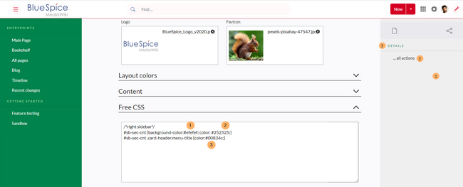
Neutral top bar backgrounds and hovers
When you set the header hightlight color, it can happen that the automatically calculated values for the searchbar as well as the button hovers and backgrounds don't fit your needs.
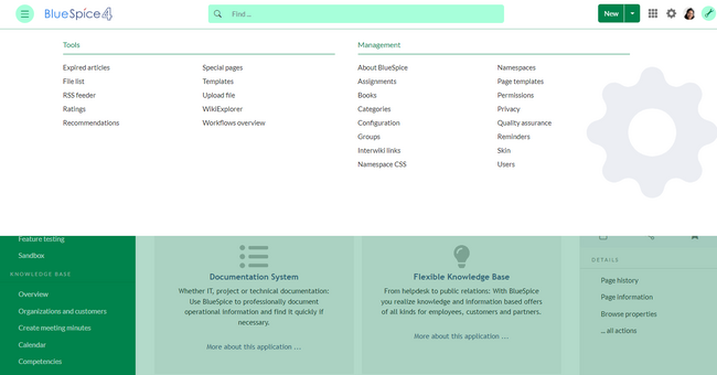
In this case, you can neutralize them to grey.
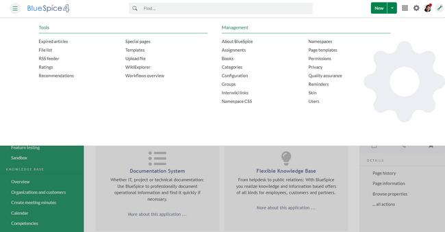
Add the following Free CSS:
/*top bar neutral search box, button backgrounds and hovers */
#nb-pri form input,
#nb-pri form button {
  border-color: #f1f3f3;
}
#nb-pri form input,
#nb-pri form button,
#sb-pri-tgl-btn,
#sb-pri-tgl-btn:hover,
.mws-dropdown-primary.dropdown-menu a:hover,
a.ico-btn:hover,
a#sb-sec-tgl-btn,
#nb-pri form .bs-extendedsearch-searchbar-clear {
  background: #f1f3f3;
}
.mws-button-primary:hover {
  background-color: #747474;
  color: #fff;
}
/*button "new" */
#nb-pri .item-center-east .new-page-split-btn #new-content {
  background: #f1f3f3;
  border: 1px solid #cbcbcb;
}
/*top bar neutral bottom border*/
#nb-pri {
  box-shadow: 0 0 4px 0 #747474;
}
.card.mega-menu {
  box-shadow: inset 0 2px 3px -2px #747474;
}
/*mega menu neutral bottom overlay*/
@media (min-width: 768px) {
  .dropdown-menu.megamenu .mm-bg {
    background-color: #747474;
  }
}
/*mega menu neutral background small viewport*/
@media (max-width: 767px) {
  .menu-list li{
        background-color: #f5f5f5;
    }
  .card.mega-menu {
        background-color: #fff;
    }
}
Removing the background swoosh from the login page
If you want to remove the blue background swoosh from the login page, add:
/*remove background swoosh from login page*/
body.mediawiki.page-Special_UserLogin {
     background-image:none
}