# '''Click''' ''Save''. The form is now available in the main namespace as ''EventChecklistHygiene.form''. [[File:Manual:Checklist-view.png|alt=Saved form|center|thumb|650x650px|Saved form]]<br />To continue editing the form, switch to the editing mode of the page (1).
# '''Click''' ''Save''. The form is now available in the main namespace as ''EventChecklistHygiene.form''. [[File:Manual:Checklist-view.png|alt=Saved form|center|thumb|650x650px|Saved form]]<br />To continue editing the form, switch to the editing mode of the page (1).
== Form elements ==
It is possible to add the following form fields to your form:
=== Inputs ===
{| class="wikitable compact" style="width: 100%;"
!Field
!Functionality
|-
|Book
|auto-complete field that finds pages in the namespace "Book"
|-
|Text
|standard text field
|-
|Textarea
|multi-line text field
|-
|Wikitext input
|multi-line text field that expects Wikitext syntax
|-
|Category multiselect
|token field to add one or more categories to the page
|-
|Checkbox
|single checkbox
|-
|Menu tag multiselect
|mulitple-values input, values are separated with the <code>enter</code>-key
|-
|Checkbox multiselect
|checkbox group
|-
|Dropdown
|dropdown select field
|-
|Number
|integer field
|-
|Radio button
|
|-
|Radio group
|
|-
|File chooser
|
|-
|Title input
|
|-
|Combo box
|
|-
|Password input
|
|-
|Tag input
|
|-
|Date
|
|-
|Title input
|
|-
|User input
|
|-
|Group input
|
|-
|Group multiselect
|
|-
|User multiselect
|
|-
|Title multiseslect
|
|-
|Date picker
|
|-
|Percent
|
|}
=== Other ===
{| class="wikitable compact"
!Element
!Description
!Options
|-
|Static Wikitext
|non-editable text
|
|-
|Button
|triggers an action (requires a defined event listener)
|
|-
|Message banner
|message that can be shown anywhere in the form;
the type that is set (notice, error, warning, success) provides the visual formatting
|visual representation of the number of completed steps in a form such as a checklist
|
|-
|Section label
|a heading to a form section
|
|-
|HR
|a visual separator line
| -
|}
=== Input field options ===
Each input field has a combination of any of these options:
{| class="wikitable compact" style="width: 100%;"
|+main
!Type
!Field
!Functionality
|-
| rowspan="6" |(all)
|Name
|field name stored in the database (avoid special characters)
|-
|Label
|text label shown to users
|-
|Help
|creates a tooltip pop-up next to the label
|-
|No layout
|hides the label
|-
|Show on
|mode in which this field is visible
|-
|Editable on
|sets when the field value can be edited
|-
|Book
|Return property
|?
|}
{| class="wikitable compact"
|+styling
!Type
!Field
!Functionality
|-
| rowspan="2" |(all)
|CSS Classes
|add individual CSS-classes for use on ''MediaWiki:Common.css''
- the class is set on the form field itself and does not include the label; multiple classes can be set together or you can add them separately
|-
|Style
|define an inline style that affects only this field. The style is applied to the wrapper and includes the label and the field
|-
| rowspan="2" |Textarea, Wikitext input
|Number of rows
|used for textareas
|-
|Placeholder
|text that is displayed before the user is typing a value (has no effect, if there is also a default value set)
|-
|Radio group
|No default value
|ensures that there is no pre-selected radio-button if a default would not make sense
|-
|Radio group, Checkbox multiselect
|Horizontal layout
|aligns multiselect checkboxes or radio groups horizontally
|-
| rowspan="3" |Button
|Icon
|displays an icon before the text, (e.g. a bootstrap-icon like <code>bi bi-calendar</code>)
|-
|Indicator
|displays an icon after the text (e.g. a bootstrap-icon like <code>bi bi-arrow-right</code>)
|-
|Framed
|when deactivated, the button looks like text only (and can be styled via CSS classes, e.g. <code>btn button-warning</code>)
|}
{| class="wikitable compact"
|+other
!Type
!Fieldset
!Field
!Functionality
|-
| rowspan="6" |(all)
| rowspan="2" |Custom widget properties
|Key
|
|-
|Value
|
|-
| rowspan="2" |Listeners
|Event
|
|-
|Callback
|
|-
| rowspan="2" |
|Default value /
Selected by default
|value that is used if the user does not provide a value; field type "checkbox" has option "Selected by default" instead
|-
|Required
|form cannot be submitted without this field having a value
|-
|Password
|
|Password strength
|weak:
medium:
strong:
|-
| rowspan="2" |Tag
|
|Input position
|inline:
outline:
|-
|
|Allow arbitrary
|It is possible to add values other than the allowed values (only necessary if allowed values are defined)
|}
== Form Settings ==
=== Appearance ===
{| class="wikitable compact"
!Field
!Functionality
|-
|Title
|
|-
|Display title
|
|-
|Display form name
|
|}
=== Behaviour ===
{| class="wikitable compact"
!Field
!Functionality
|-
|
|
|-
|
|
|}
=== Infrastructure ===
{| class="wikitable compact"
!Field
!Functionality
|-
|
|
|-
|
|
|}
=== Target ===
{| class="wikitable compact"
!Field
!Functionality
|-
|
|
|-
|
|
|}
=== Listeners ===
{| class="wikitable compact"
!Field
!Functionality
|-
|
|
|-
|
|
|}
==Create a checklist instance==
==Create a checklist instance==
Latest revision as of 15:03, 19 May 2026
The Forms extension allows formatting a wiki page or a user dialog as a form. It is also used in conjunction with the Workflows extension where it provides input forms for workflow data.
To create a checklist as a form, for example, the following steps are necessary:
Create the checklist form.
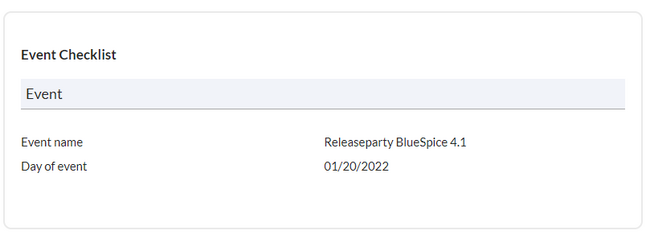
Create checklist instances.
Optionally, the styling of the form can be adjusted.
As an example, we are creating the first fields for an event where food-related hygiene information has to be tracked.
Event checklist example
Create a checklist form
Create the page Checklist Event Hygiene.form.Creating a new formThis opens the Form editor.Form editor
Add a form section:
Select the Section label element under Form Elements > Other (see screenshot annotation 2) and, holding down the left mouse button, drag it into the interactive form editor field below.
Click anywhere in the Section label line. The field inspector opens.
Enter the Name. This is saved as a field ID in the database and should therefore not contain any special characters.
Enter the Title for the section label. This is displayed as the visible label for the text field.Adding the first section header
Create the form fields for the Event section. Here we add a text box as an example.
Drag the Text element from Form elements > Inputs under the section heading.
Click anywhere in the text field line. The field inspector opens.
Enter the Name. This is used as the database ID for this field and should therefore not contain any special characters.
Enter the Label. This is displayed as the visible label for the text field.
Add more form elements.
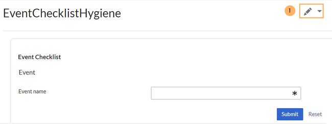
ClickSave. The form is now available in the main namespace as EventChecklistHygiene.form. Saved form To continue editing the form, switch to the editing mode of the page (1).
Form elements
It is possible to add the following form fields to your form:
Inputs
Field
Functionality
Book
auto-complete field that finds pages in the namespace "Book"
Text
standard text field
Textarea
multi-line text field
Wikitext input
multi-line text field that expects Wikitext syntax
Category multiselect
token field to add one or more categories to the page
Checkbox
single checkbox
Menu tag multiselect
mulitple-values input, values are separated with the enter-key
Checkbox multiselect
checkbox group
Dropdown
dropdown select field
Number
integer field
Radio button
Radio group
File chooser
Title input
Combo box
Password input
Tag input
Date
Title input
User input
Group input
Group multiselect
User multiselect
Title multiseslect
Date picker
Percent
Other
Element
Description
Options
Static Wikitext
non-editable text
Button
triggers an action (requires a defined event listener)
Message banner
message that can be shown anywhere in the form;
the type that is set (notice, error, warning, success) provides the visual formatting
Subject: Existing form fields can be used as variables here. The value is taken from the form.
Content: As in the subject, existing form fields can also be used as variables here. The value is taken from the form.
Localization messages in combination with form fields can also be used as subject or email body:
{{int:Mailsubject| {{{name}}}|{{{surname}}} }}
Adjust the styling
Common.css
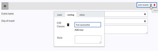
To style individual elements in the form, go to the styling tab in the options dialog. There, you can enter a css class name. The styling is then defined on the MediaWiki:Common.css page (admin rights are required).
To style the section heading:
Open the styling tab in the options menu of the Event heading field.
Add a new CSS class and enter a selector name (CSS Classes field), e.g. frm-sectionhd.Add a css class
Paste the following style declarations into the MediaWiki:Common.css page, e.g.:
If you do not have permission to view this page, you can enter style information directly for each element in the form via inline styling.
Inline styling
Without access to MediaWiki:Common.css, the style information can be entered directly in the form. However, with many recurring style declarations this is not efficient in contrast to the definition of CSS classes in MediaWiki:Common.css.
As an example, let's apply the previous section heading example directly as inline styling. To do this, open the options menu of the ech-event form element again. Enter the following statement in the Styling field and save the change:


